Many local businesses have a strong offer but an inconsistent look: different colors, random fonts, mixed-quality photos. The result is hesitation. Visual consistency is a mental shortcut: if it looks consistent, it feels professional.
1) Consistency equals trust
It impacts:
- price perception (premium vs cheap),
- recall and recognition,
- referrals (“I recognize that brand”),
- conversion rate (less friction).
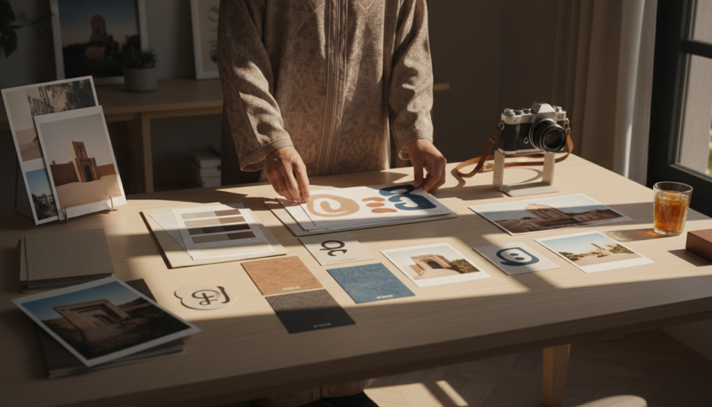
2) A simple 4-pillar style guide
You don’t need 80 pages. Start with: 1) Colors (1 primary, 1 secondary, 2 neutrals) 2) Typography (headings + body) 3) Photo style (lighting, mood, subjects) 4) Components (buttons, cards, icons, radius)
3) Photo style is highly “SEO visible”
Better visuals increase:
- time on page,
- engagement,
- shares.
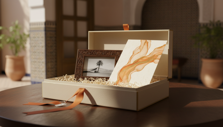
For a photo lab + personalized gifts, a winning style often includes:
- soft natural light,
- modern Moroccan lifestyle scenes,
- close-ups of print quality,
- warm tones with a controlled accent color.
4) Align assets across website, WhatsApp, and social
Your customer journey often looks like: Google → website → WhatsApp → website → delivery. If each step has a different style, trust drops. Reuse:
- the same primary CTA button,
- the same badges (delivery, quality),
- consistent icon style,
- consistent tone of voice.
5) Use repeatable page templates
For service pages:
- clear hero (promise + proof + CTA),
- offer blocks (packs/categories),
- reassurance (lead time, delivery),
- short FAQ,
- final CTA.
Design shouldn’t “surprise”—it should reassure.
Internal links to include: /about/ (or /a-propos/), /photo-printing/, /gift-ideas/.