Customers don’t buy only a product—they buy a promise. Today, that promise is judged first through visuals: your website hero, Instagram posts, Google listing photos, packaging, and video snippets. If your visuals feel “amateur,” your offer feels riskier—even when your quality is excellent.
Here are 9 practical levers to move from “okay” content to content that converts.
1) Make your message clear in 3 seconds
Before you shoot anything, answer one question: what should people understand instantly? Examples:
- “Delivery anywhere in Morocco”
- “Premium prints, true-to-life colors”
- “Personalized gifts, ready to offer”
Clarity creates consistency: the same style, angles, and priorities across every page.
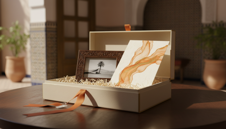
2) Invest in one strong hero image (site + social)
A hero image should: 1) set the mood (modern, elegant, trustworthy), 2) show a real situation (humans build trust), 3) leave clean negative space for readable text.
For Souary-like brands, lifestyle scenes (families, couples, young professionals) + prints in hand are powerful because they show the result.
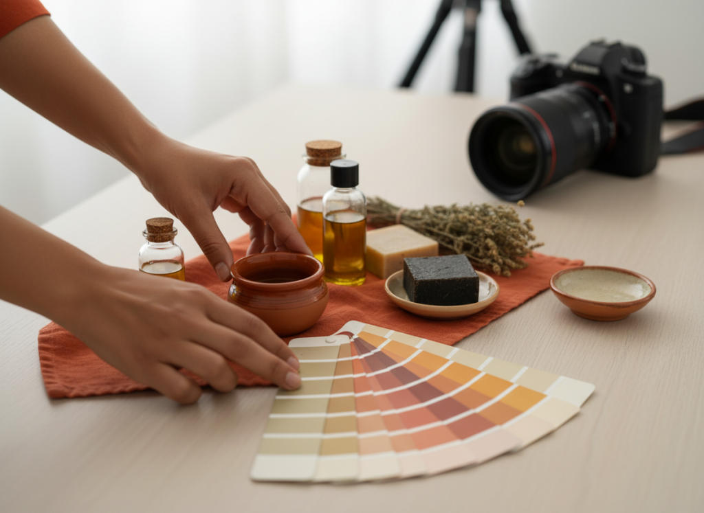
3) Show proof: details, finishes, “before/after”
Conversion visuals highlight quality:
- paper texture and sharpness,
- close-ups of albums, frames, boxes,
- clean packaging (“gift-ready”).
Tip: create one “macro proof” image per product—it instantly reassures.
4) Build clean packshots (neutral background)
For catalog pages, you need consistent packshots:
- light or soft gray background,
- subtle shadow,
- steady framing,
- no distracting props.
Your product range suddenly feels bigger and more premium.
5) Create 3 content levels (fast → deep)
To stay present without burnout:
- Level 1 (fast): stories, behind-the-scenes, deliveries
- Level 2 (standard): carousels (formats, prices, packs)
- Level 3 (premium): short videos, testimonials, case studies
A video studio can produce Level 3 in batches (same setup, same lighting) to scale faster.
6) Use video to explain (not only to look “cool”)
The videos that convert answer:
- “How does it work?”
- “How long does it take?”
- “What exactly do I receive?”
One 20–40 second explainer can replace ten WhatsApp messages.
7) Standardize colors and typography
If buttons and headings change from page to page, the site feels inconsistent. Fix:
- one action color (e.g., orange),
- one secondary color (e.g., studio blue),
- two fonts max.
Everything else should serve readability.
8) Build one page per intent
“10×15 photo prints” has different questions than “corporate video.” Create dedicated pages with:
- a clear hero,
- a simple offer,
- a short FAQ,
- a WhatsApp CTA (“Order” / “Get a quote”).
9) End with a no-friction CTA
Simpler ordering = more sales. WhatsApp is perfect for MVP—as long as you have:
- a prefilled message (product + format + quantity),
- a visible button,
- a clear promise (lead times + delivery).
Quick checklist (this week)
- [ ] 1 premium lifestyle hero (website)
- [ ] 6 neutral packshots (best sellers)
- [ ] 1 macro “quality proof”
- [ ] 1 “how to order” video
- [ ] 3 carousels (prices / formats / packs)
Internal links to include: /studio-video/, /contact/.